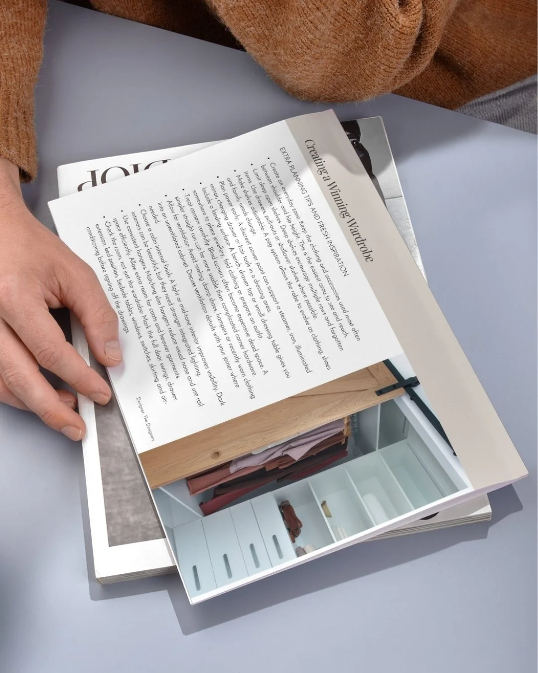
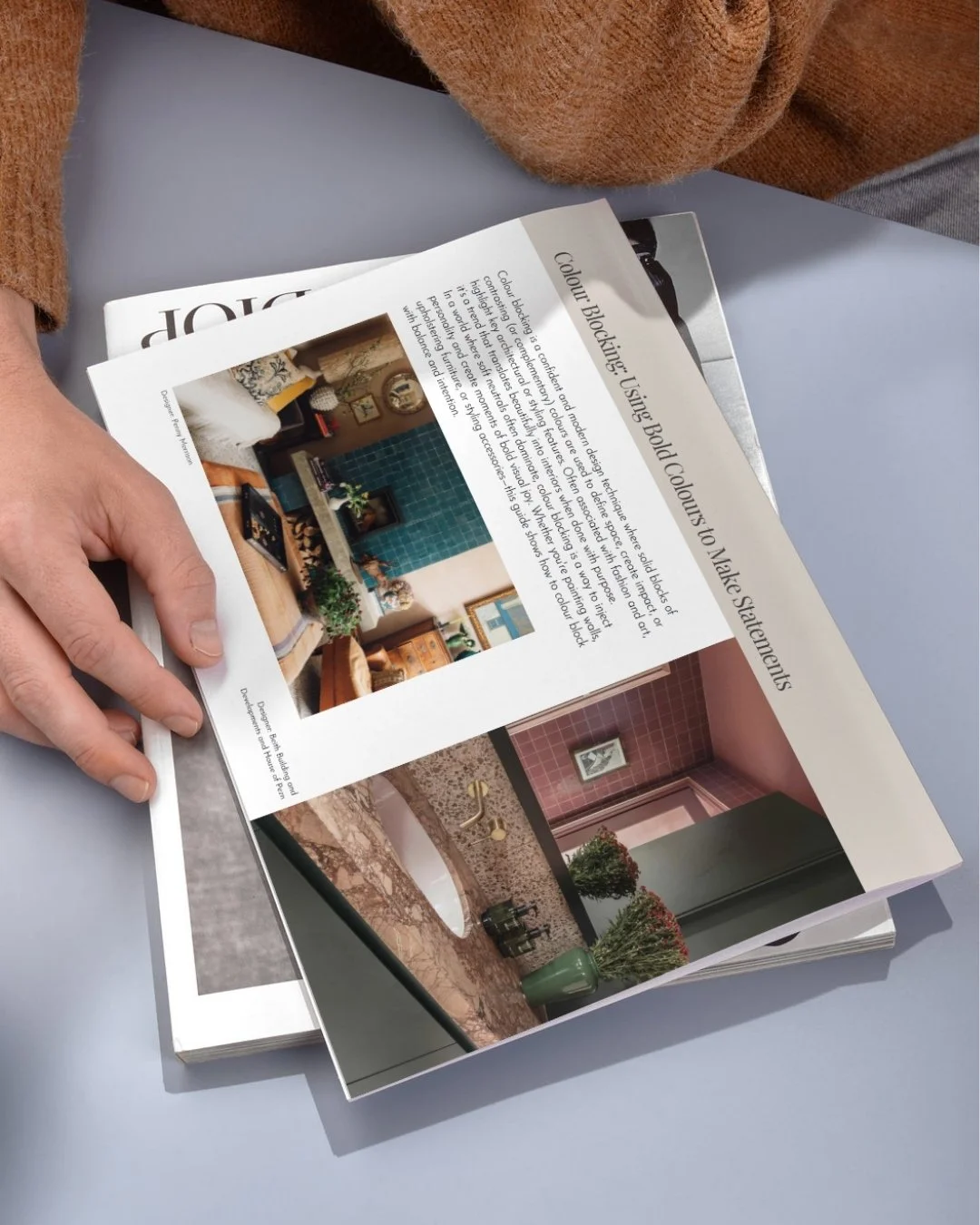
 Image 1 of 3
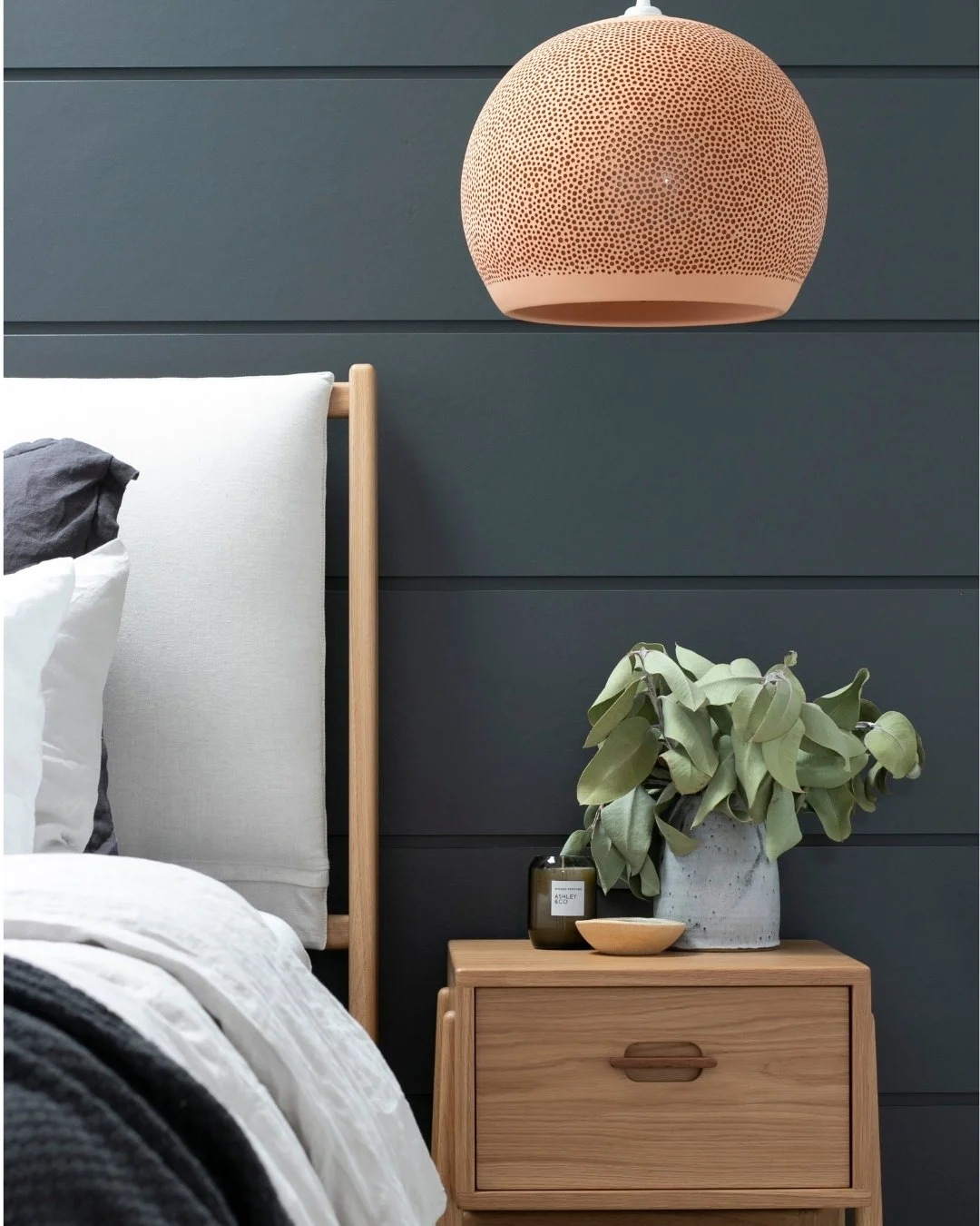 Image 2 of 3
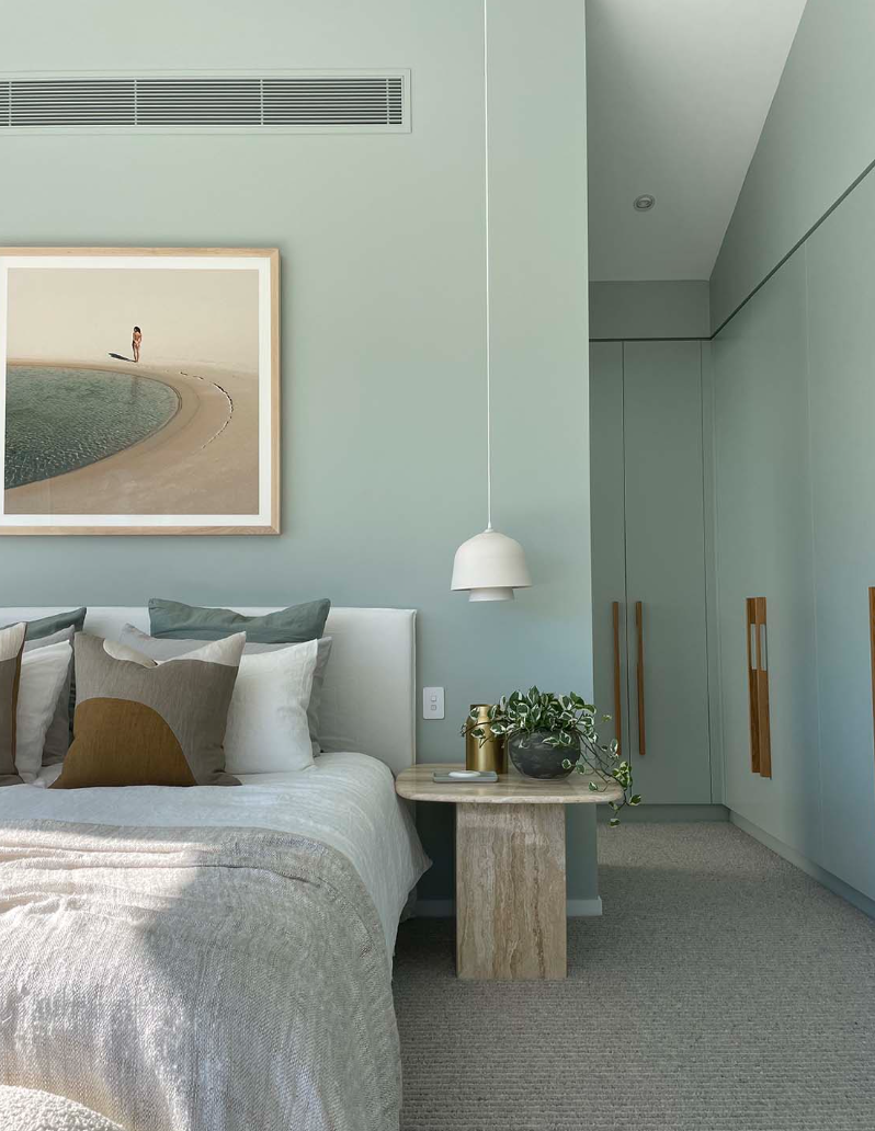 Image 3 of 3
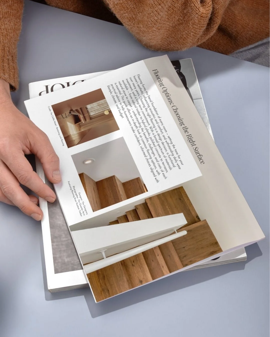
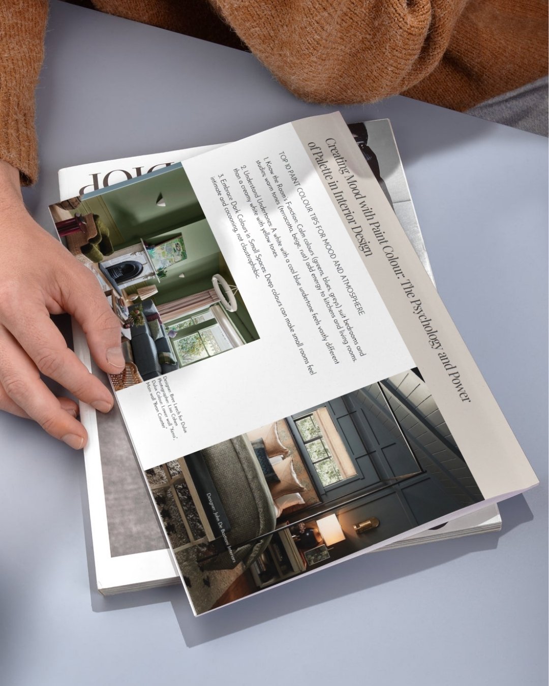
A practical downloadable guide to using colour blocking with confidence—creating impact, defining spaces and bringing more personality into your home.
Colour blocking is about more than placing two bold shades beside one another. Used thoughtfully, it can change the proportions of a room, highlight architectural features, visually separate different zones and bring energy to an otherwise simple interior.
In this downloadable guide, we share The Designory’s practical approach to using colour blocking in a way that feels intentional and connected. From pairing unexpected hues to working with scale, placement and proportion, this guide will help you introduce stronger colour without losing balance or cohesion.
Inside the guide:
The key design principles behind successful colour blocking
How colour blocking can define zones and change the way a room is perceived
Advice on selecting colours that feel bold but still work together
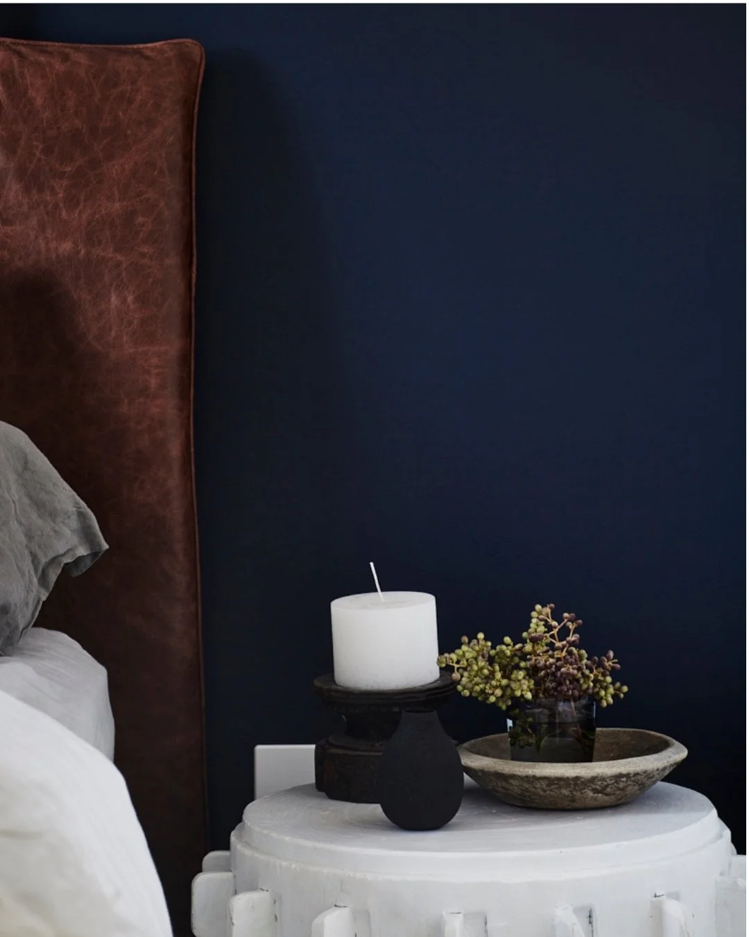
Tips for balancing statement shades with quieter supporting tones
Guidance on scale, proportion and deciding how much colour to use
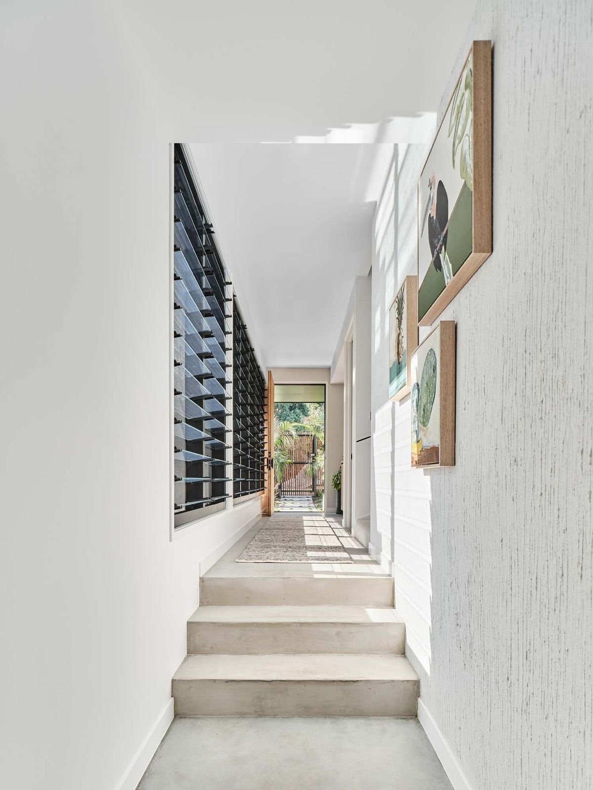
Ideas for highlighting architectural details, joinery and individual walls
Ways to use colour blocking across paint, furniture, textiles and decorative finishes
Inspiration from real interiors that use bold colour successfully
Practical ideas for introducing the look at different budgets
Advice for creating impact without making the room feel disjointed or overly busy
Whether you’re refreshing a single room, highlighting a favourite architectural feature or developing a more expressive palette throughout your home, this guide will help you use colour with greater clarity and confidence.
Created by designers and made for real homes, it gives you the practical starting point you need to test combinations, refine placement and make bolder decisions without relying on guesswork. Its clear, approachable format follows The Designory’s Kickstarter guides, combining designer insight with actionable advice you can put to use immediately.
Because colour should feel expressive, personal and joyful—not intimidating.
Digital product: Delivered as a downloadable PDF.
Made by designers. Made for you.
A practical downloadable guide to using colour blocking with confidence—creating impact, defining spaces and bringing more personality into your home.
Colour blocking is about more than placing two bold shades beside one another. Used thoughtfully, it can change the proportions of a room, highlight architectural features, visually separate different zones and bring energy to an otherwise simple interior.
In this downloadable guide, we share The Designory’s practical approach to using colour blocking in a way that feels intentional and connected. From pairing unexpected hues to working with scale, placement and proportion, this guide will help you introduce stronger colour without losing balance or cohesion.
Inside the guide:
The key design principles behind successful colour blocking
How colour blocking can define zones and change the way a room is perceived
Advice on selecting colours that feel bold but still work together
Tips for balancing statement shades with quieter supporting tones
Guidance on scale, proportion and deciding how much colour to use
Ideas for highlighting architectural details, joinery and individual walls
Ways to use colour blocking across paint, furniture, textiles and decorative finishes
Inspiration from real interiors that use bold colour successfully
Practical ideas for introducing the look at different budgets
Advice for creating impact without making the room feel disjointed or overly busy
Whether you’re refreshing a single room, highlighting a favourite architectural feature or developing a more expressive palette throughout your home, this guide will help you use colour with greater clarity and confidence.
Created by designers and made for real homes, it gives you the practical starting point you need to test combinations, refine placement and make bolder decisions without relying on guesswork. Its clear, approachable format follows The Designory’s Kickstarter guides, combining designer insight with actionable advice you can put to use immediately.
Because colour should feel expressive, personal and joyful—not intimidating.
Digital product: Delivered as a downloadable PDF.
Made by designers. Made for you.