Get It Right – Without Just Painting It White
How to Create a Cohesive Colour Scheme in Your Home
When it comes to decorating your home, there’s no one-size-fits-all approach to colour. Some of us gravitate toward bold and bright hues, while others are drawn to calm, neutral tones. But whatever your personal style, creating a cohesive colour flow throughout your home can have a huge impact — and no, it doesn’t mean you have to paint everything white.
We asked some of our favourite industry experts — including Erin Hearns, Assistant Colour Manager at Haymes Paint, Kate Swinson from The Papered Room, and our own co-owner and artist Cat Gerke — for their top advice on using colour confidently and cohesively in your home.
Start with Balance, Not Just Boldness
Erin Hearns, Haymes Paint
“It’s all about creating a balance of colours that feel interesting and inviting,” Erin explains. Whether you’re working with warmer undertones (think yellows, reds, terracottas) or cooler hues (blues and greens), choose one temperature range and stick with it throughout your palette.
Some easy ways to create a cohesive look:
Monochromatic schemes: Use tints, tones and shades of the same colour
Analogous schemes: Pick colours that sit next to each other on the colour wheel — blues, teals and greens, or peaches, nudes and pinks, for example
Textural elements in the same colour family — such as textured renders, feature walls or painted finishes — can also create depth without feeling overpowering.
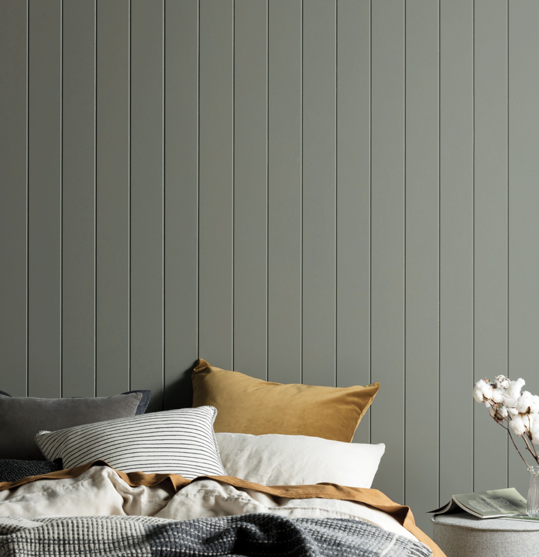
+ Colour: Haymes Paint “Wilds” + Product: Haymes Paint Ultra Premium Expressions Interior

Let the Wallpaper Do the Talking
Kate Swinson, The Papered Room
According to Kate, wallpaper is one of the most powerful tools for bringing colour and character into your home. “Wallpaper adds instant depth and emotion,” she says. “It can turn a transitional space, like a hallway, into something meaningful and interactive.”
Try:
Choosing a wallpaper with a chalky neutral base and coloured detailing
Using wallpaper as a visual link between rooms or zones
Making your entryway or hallway a moment of impact — it's the first impression of your home

Cat Gerke on Colour:
Feel First, Then Choose
When it comes to choosing colours for your home, I always start with one question:
“How do you want the space to feel?”
That feeling becomes your guide.
If you want a room to feel calm, soft and warm, then start with a warm base — and yes, that applies even to blues. Every colour has a temperature, and the difference between a warm and cool blue can completely shift the mood. The same goes for greens, greys, and even whites.
Once you’ve nailed the mood, the next step is layering tones. Stick with complimentary colours if you want a serene, cohesive palette — think soft terracotta paired with earthy greens, or dusty blues with sandy neutrals. These combinations feel grounded and relaxing, like nature’s own palette.
Want more energy or boldness in your space? Go for contrasting tones. Opposite colours on the wheel — like a rust with teal, or peach with navy — add a dynamic edge and really bring the room to life.
For me, colour is never just visual — it’s emotional. It’s about creating spaces that feel as good as they look. Whether you’re working with paint, artwork, textiles or furniture, make sure your palette supports how you want to live in the space. And don’t forget to trust your gut — it usually knows exactly what you need.